User Experience is King with Sugar 6.5
From the very beginning with Sugar 1.0 eight years ago, we have always designed the Sugar app first and foremost for the end users of the application. Simply put, the Sugar app needs to help our users get their job done. From working with customers to monitoring key performance metrics, the purpose of Sugar is to help companies make the connections that matter.
“Users first” is our primary design focus because CRM applications have a long history of failed implementations due to a lack of adoption by the end users. Why is this? Because legacy CRM applications like Siebel and Salesforce.com have been traditionally designed for the buyer first, i.e. management. We think this is the wrong approach and has led to frustrated users. Our first design use case is around a customer representative getting ready to contact a customer and needing to prepare for the call, meeting or tweet. By ensuring the Sugar application is highly useful and useable for their end users, managers can then rely on the forecast, pipeline and issue resolution insight coming out of their Sugar application.
Sugar 6.5 User Experience
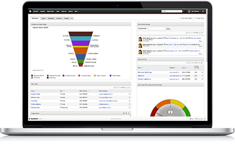 Sugar 6.5 became GA (generally available) last week for all of our customers and partners. As the latest update to Sugar 6, the 6.5 release brings a continued focus on updating the Sugar user experience. The Sugar 6.5 release brings us three major improvements in this area:
- Fresh Look w/ New Navigation Bar
- Fast and Simple Search
- Sub-Second Screens with More AJAX
But frankly this is just the beginning. This past year has been an exciting one as we have planned out a series of updates to the Sugar UX over the next several releases. Many of our customers and partners had the opportunity to meet our UX team at SugarCon 2012 and get to know Wes Moran and Omair Ali. These two guys are currently leading a major redesign of the Sugar user experience and the 6.5 release is the first release where their latest and greatest ideas have started to really take shape. If you had the chance to participate in the SugarCon UX Lab, you will have seen the exciting direction we are going with Sugar in the future.
One of the things I am most excited about is the fanatic focus on user-centered design that these guys have brought to Sugar. Wes and Omair are reaching out to the Sugar Community and engaging key stakeholders in a dialogue about “who are the users of Sugar?”, “what are their expectations and requirements?”, “how can they be more productive?”. These interviews are then translated into a series of interactive prototypes that then guide our developers through the development process. With the 6.5 release, this design/build process really kicked into gear.
Meet Omair
Sugar 6.5 brought one of the first major contributions from our new lead Interaction Designer at SugarCRM, Omair Ali. Omair joined us last fall and took on the redesign of the Sugar Navigation Bar as his first major project.
Here are Omair’s thoughts about this project:
After some initial observations of users late last year, one common usability issue kept repeating itself: too much scrolling. Our usability labs found our users constantly scrolling to find relevant data. Prime real-estate was not being used in the best possible way.
Learning from these observations, we focused first on the navigation bar. A prime strip of screen real estate was given to the quick create icons, but rarely utilized. Users had to traverse across two separate navigation bars and lost even more precious screen real estate. This was the first thing I wanted to change (and get right). The navigation bar is the most crucial element in working in any application. It shouldn’t be a task or take months to master!
Since Facebook, Google, LinkedIn, etc were impacting so much of our users’ perceptions on how an interface functions, I had to take this into consideration when coming up with a design solution for the updated 6.5 Navigation. The goal was to combine three navigation bars into one.
By introducing layered menus, we were able to trim 3 inches of fat from the top. The end result was a much more lean, functional navigation bar. 100% of our UX survey (54 partners and customers) preferred the 6.5 bar compared to the previous one. The new navigation bar also enabled primary functions to stay in focus even when scrolling on a long page.
Search and Faster Screens Round off the Release
In addition, an entirely new Search engine has been introduced in Sugar 6.5 built on the Lucene open source project. This new full text search capability will deliver even more accurate searches that can scan across more data than ever before. Simplifying search will make your users happier than ever with their Sugar.
And of course, the performance improvements made in Sugar 6.5 will put a smile on every user’s face. With performance optimizations at both the UI and database layers, 6.5 is fast, fast, fast.
We are excited to bring you all of these exciting improvements and more in the Sugar 6.5 release. Watch the Sugar 6.5 Demo and see what Sugar can do for you today.